import math
from pathlib import Path

import matplotlib.pyplot as plt
import numpy as np
import pandas as pd
from wordcloud import WordCloud
In [1]:
In [2]:
permutation_csv = Path("results/rsa_permutation_results.csv")
null_dist_dir = Path("results/null_distributions")
out_dir = Path("./")
out_dir.mkdir(parents=True, exist_ok=True)

df = pd.read_csv(permutation_csv)

monkey = "monkeyF"
roi = "IT"

subset = df[(df["monkey"] == monkey) & (df["roi"] == roi)].sort_values("noise_level")
noise_levels = subset["noise_level"].tolist()

noise_levels = [0.01, 0.1, 0.25, 0.35, 0.5, 0.65, 0.75, 0.90, 0.99]

n_plots = len(noise_levels)
ncols = 3
nrows = 3

fig, axes = plt.subplots(
    nrows=nrows, ncols=ncols, figsize=(4.5 * ncols, 3.5 * nrows), squeeze=False
)
axes = axes.flatten()

subject_name = monkey.replace("monkey", "")
fig.suptitle(
    f"Permutation Null Distributions: Macaque {subject_name} | {roi}",
    fontsize=18,
    fontweight="bold",
    y=1.02,
)

for idx_plot, noise in enumerate(noise_levels):
    ax = axes[idx_plot]
    row_data = subset[subset["noise_level"] == noise].iloc[0]

    true_score = float(row_data["true_alignment_score"])
    p_value = float(row_data["p_value"])

    npy_filename = f"null_dist_{monkey}_{roi}_noise_{noise:.2f}.npy"
    npy_path = null_dist_dir / npy_filename

    if not npy_path.exists():
        ax.text(0.5, 0.5, f"Missing:\n{npy_filename}", ha="center", va="center")
        ax.set_title(f"Noise: {noise:.2f}")
        ax.set_xticks([])
        ax.set_yticks([])
        continue

    null_dist = np.load(npy_path)

    ax.hist(
        null_dist,
        bins=30,
        density=False,
    )

    ax.axvline(
        x=true_score,
        color="red",
        linewidth=2.5,
        linestyle="--",
        label=f"True Score ({true_score:.3f})",
    )

    ax.set_title(f"Stable Diffusion Noise: {noise:.2f}", fontsize=12)
    ax.set_xlabel("RSA Score (rho-a)", fontsize=10)
    ax.set_ylabel("Frequency", fontsize=10)
    ax.spines["top"].set_visible(False)
    ax.spines["right"].set_visible(False)

    p_text = "p < 0.001" if p_value < 0.001 else f"p = {p_value:.3f}"
    ax.text(
        0.05,
        0.90,
        p_text,
        transform=ax.transAxes,
        fontsize=11,
        fontweight="bold",
        color="#333333",
        bbox=dict(facecolor="white", alpha=0.6, edgecolor="none"),
    )
    ax.legend(loc="upper right", fontsize=9)

for empty_idx in range(n_plots, len(axes)):
    fig.delaxes(axes[empty_idx])

fig.tight_layout()
plt.show()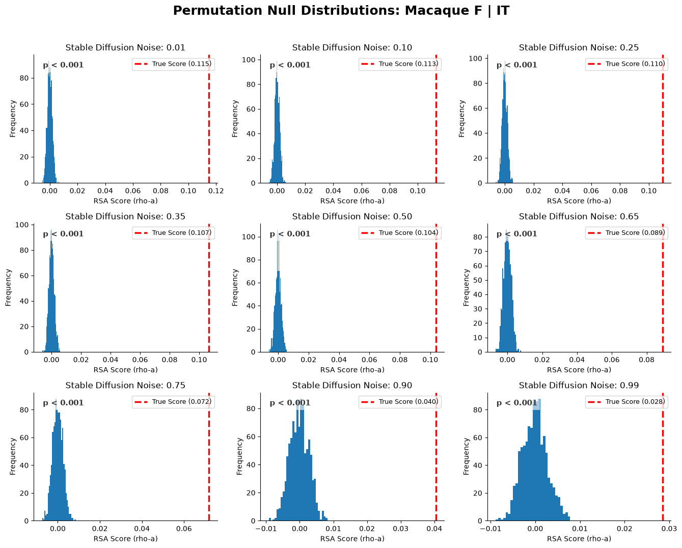
In [3]:
import matplotlib.pyplot as plt
import numpy as np
import pandas as pd
from pathlib import Path

# Load data
permutation_csv = Path("results/rsa_permutation_results.csv")
scores_df = pd.read_csv(permutation_csv)

monkeys = ["monkeyF", "monkeyN"]
ROI_ORDER = ["V1", "V4", "IT"]

# Pre-calculate noise levels from the first monkey to set up figure size
temp_data = scores_df[scores_df["monkey"] == "monkeyF"].pivot_table(
    index="roi", columns="noise_level", values="true_alignment_score", aggfunc="mean"
)
noise_levels = sorted(temp_data.columns)

fmt_string = "{:.3f}"
cbar_label = "RSA Score (Spearman rho-a)"

# Figure setup (2 rows, 1 column)
fig, axes = plt.subplots(nrows=2, ncols=1, figsize=(0.8 * len(noise_levels) + 3, 7))

for idx, monkey in enumerate(monkeys):
    ax = axes[idx]
    monkey_data = scores_df[scores_df["monkey"] == monkey]

    # Create the pivot table for the heatmap
    heat = monkey_data.pivot_table(
        index="roi", columns="noise_level", values="true_alignment_score", aggfunc="mean"
    )
    heat = heat.reindex(index=[r for r in ROI_ORDER if r in heat.index])
    heat = heat[noise_levels]

    masked_data = np.ma.masked_invalid(heat.to_numpy(dtype=float))
    im = ax.imshow(masked_data, aspect="auto", cmap="magma")

    ax.set_xticks(range(len(noise_levels)))
    # Only show x-axis labels on the bottom plot to keep it clean, or both if preferred
    ax.set_xticklabels([f"{n:.2f}" for n in noise_levels], rotation=45)

    ax.set_yticks(range(len(heat.index)))
    ax.set_yticklabels(heat.index)

    if idx == 1:
        ax.set_xlabel("Normalized Noise Level", fontsize=12)
    ax.set_ylabel("Brain Region (ROI)", fontsize=12)

    subject_name = monkey.replace("monkey", "")
    ax.set_title(f"Macaque {subject_name}", fontsize=14, pad=10)

    fig.colorbar(im, ax=ax, label=cbar_label)

    # Calculate min/max just for text contrast
    heat_min = heat.min().min()
    heat_max = heat.max().max()

    # Add text annotations
    for i, area in enumerate(heat.index):
        for j, noise in enumerate(noise_levels):
            value = heat.loc[area, noise]
            if pd.isna(value):
                continue

            norm_val = (value - heat_min) / (heat_max - heat_min) if heat_max != heat_min else 0.5
            text_color = "black" if norm_val > 0.7 else "white"

            ax.text(j, i, fmt_string.format(value), ha="center", va="center", color=text_color, fontsize=8)

plt.tight_layout()
plt.show()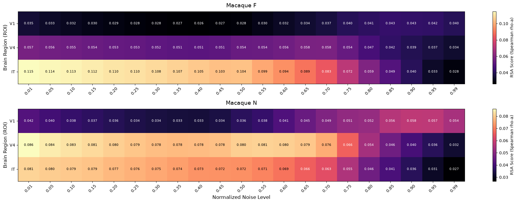
In [4]:
import matplotlib.pyplot as plt
from matplotlib.ticker import FormatStrFormatter
import pandas as pd
from pathlib import Path

# Load data
bootstrap_csv = Path("results/rsa_bootstrap_ci_results.csv")
ceiling_csv = Path("results/monkey_rsa_comparison.csv")

boot_df = pd.read_csv(bootstrap_csv)
ceiling_df = pd.read_csv(ceiling_csv)

def get_noise_ceiling(ceiling_df, roi):
    subset = ceiling_df[ceiling_df["ROI"] == roi]
    if subset.empty:
        return None
    return subset["rsa_score"].mean()

ROI_COLORS = {"V1": "#4C72B0", "V4": "#DD8452", "IT": "#8172B2"}
ROI_ORDER = ["V1", "V4", "IT"]
monkeys = ["monkeyF", "monkeyN"]

fig, axes = plt.subplots(nrows=2, ncols=1, figsize=(9, 10))

for idx, monkey in enumerate(monkeys):
    ax = axes[idx]
    monkey_data = boot_df[boot_df["monkey"] == monkey]

    for roi in ROI_ORDER:
        roi_data = monkey_data[monkey_data["roi"] == roi].sort_values("noise_degree")
        if roi_data.empty:
            continue

        noise_levels = roi_data["noise_degree"].to_numpy(dtype=float)
        boot_means = roi_data["boot_mean"].to_numpy(dtype=float)
        ci_low = roi_data["ci_low"].to_numpy(dtype=float)
        ci_high = roi_data["ci_high"].to_numpy(dtype=float)

        ceiling = get_noise_ceiling(ceiling_df, roi)
        legend_label = f"{roi} (Ceiling: {ceiling:.2f})" if ceiling else f"{roi}"

        ax.plot(
            noise_levels, boot_means, marker="o", markersize=6, linewidth=2,
            color=ROI_COLORS.get(roi, "#333333"), label=legend_label
        )
        ax.fill_between(
            noise_levels, ci_low, ci_high, color=ROI_COLORS.get(roi, "#333333"),
            alpha=0.15, linewidth=0
        )

    subject_name = monkey.replace("monkey", "")
    ax.set_title(f"Macaque {subject_name}", fontsize=14, pad=10)

    if idx == 1:
        ax.set_xlabel("Normalized Noise Level", fontsize=14)
    ax.set_ylabel("RSA Score (Spearman rho-a)", fontsize=14)

    ax.spines["top"].set_visible(False)
    ax.spines["right"].set_visible(False)

    ax.xaxis.set_major_formatter(FormatStrFormatter("%.2f"))
    ax.tick_params(axis="both", labelsize=12)
    ax.grid(linestyle="--", alpha=0.7)

    ci_level = int(monkey_data["ci"].iloc[0]) if "ci" in monkey_data.columns else 95
    left_handles, left_labels = ax.get_legend_handles_labels()
    legend = ax.legend(
        left_handles, left_labels, loc="upper right", fontsize=11,
        title=f"Shaded bands denote {ci_level}% Bootstrap CI"
    )
    legend.get_title().set_fontsize(11)

plt.tight_layout()
plt.show()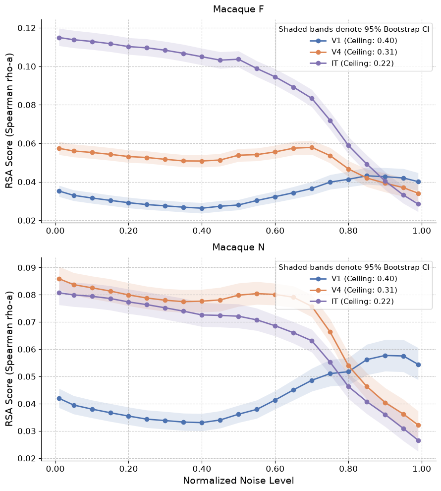
In [5]:
semantic_csv = Path("results/semantic_ordering.csv")
semantic_df = pd.read_csv(semantic_csv)

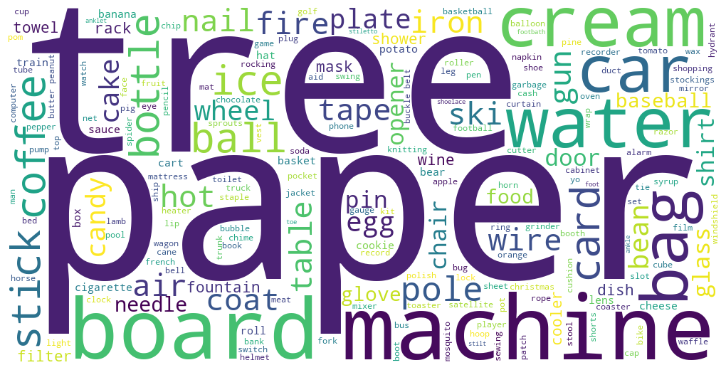
text = " ".join(semantic_df['clean_category'].astype(str))
wordcloud = WordCloud(width=1000, height=500, background_color='white', max_words=200, random_state=42).generate(text)

fig, ax = plt.subplots(figsize=(10, 5))
ax.imshow(wordcloud, interpolation='bilinear')
ax.axis('off')

plt.tight_layout(pad=0)
plt.show()