Every year, high school seniors rise to one of their largest life challenges: College Admission. Each country has its system for college admission shaping the career journey of its students. Most countries use some form of college admission test. Today, I will be exploring with you Egypt’s college admission test: Sanawya Amma (ثانوية عامة).
Taking the exam is a rite of passage for any Egyptian student. Students know that their whole future depends on the exam results. Hence, preparation for it starts months before the exams, and when the exams start the country seems to stop in unity, wishing success for these students.
It is no surprise that the students give the assessment this feeling of importance. Students enter the faculty and the university of their choice based on the exam’s result. After the exam, the ministry releases the minimum grade for each faculty. If a student scores below the grade assigned to his faculty of choice, he won’t be able to fulfill his dreams. Thus, the test is given this huge importance.
Given the vitality of this test, we are going to discover its results. We’re aiming to understand what factors into exam success, and also analyze the distribution of the marks. By the end, we will hopefully find useful insights for the students. So, let’s get started!
About the dataset
In this analysis, we will use the High School (ثانوية عامة) Public Results 2022 EG from Kaggle found here. This dataset contains the exam results for the year 2022. The data was collected from public websites that released the test results.
Let’s start by viewing some instances in the dataset and the avillable feature.
import pandas as pddf = pd.read_csv('High_School_Public_Results_2022_EG_first_attempt.csv')df.drop('desk_no', axis=1, inplace=True)df.head()
The data set contains the following columns: - school_name: The name of the student’s school. - administration: The administration of the student’s school. An administration is a group of schools that are managed by the same entity. They are divided based on the geographical location of the schools. - city: The city where the student is from. - branch: The branch of Sanawya Amma the student is in. There are three branches: Humanities (ادبي), Science (علمي علوم), and Mathematics (علمي رياضة). - Percentage: The student’s scaled grade in the exam out of 100. This is the most important feature as it determines the student’s future. - status: The student’s status in the exam. There are three statuses: Passed, Second Chance, and Failed. More on that in the next section. - [subject] columns: The student’s grade in the subject. We will see the subjects in the next section. - total: The student’s total grade in the exam. This is the sum of the student’s grades in all subjects. It is out of 410. The percentage is calculated by dividing the total by 410 and multiplying by 100. - gender: The student’s gender. Either M or F.
Sanawya Amma Structure
Branches
Sanawya Amma has three branches: Humanities (ادبي), Science (علمي علوم), and Mathematics (علمي رياضة). Each branch has its own set of subjects. The subjects are divided into two categories: Core and Elective. The core subjects are the same for all branches, while the elective subjects are different for each branch.
Let’s understand how the students are distributed among the branches.
Subjects
The core subjects are divided to two categories: those who affect the total grade and those who don’t. Students are only required to pass the subjects that affect the total grade. To ease the analysis, we will use core subjects to refer to the subjects that affect the total grade, elective subjects to electives that affect the total grade, and pass-fail subjects to the subjects that don’t affect the total grade. Note: that this is not the official terminology.
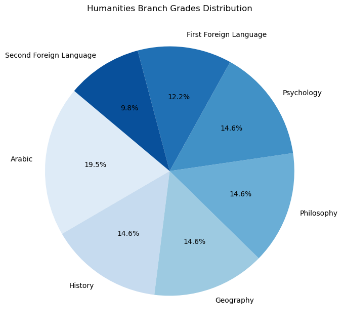
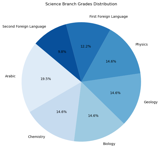
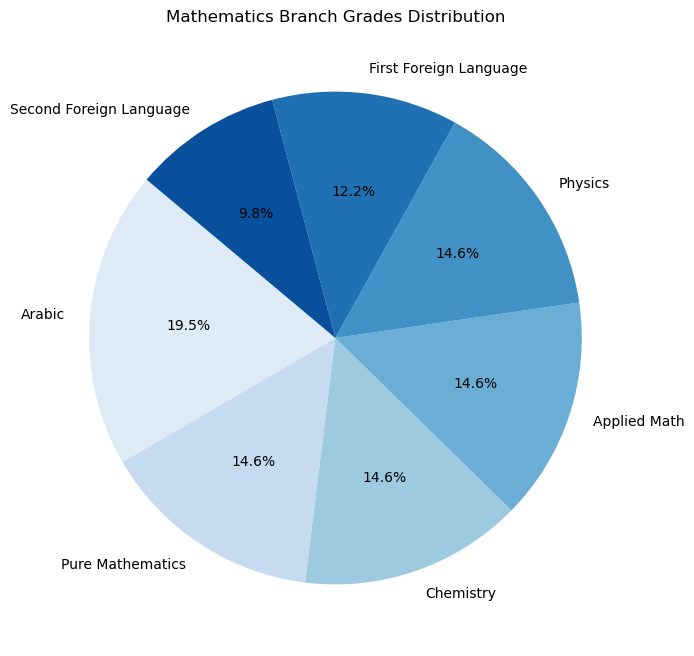
The core subjects are: - Arabic: The Arabic language scored out of 80. - First Foreign Language: The first foreign language, English, scored out of 50. - Second Foreign Language: The second foreign language, French or German, scored out of 40.
The elective subjects for each branch are: - Humanities: - History: Scored out of 60. - Geography: Scored out of 60. - Philosophy: Scored out of 60. - Psychology: Scored out of 60. - Science: - Biology: Scored out of 60. - Chemistry: Scored out of 60. - Physics: Scored out of 60. - Geology: Scored out of 60. - Mathematics: - Pure Mathematics: Scored out of 60. - Applied Mathematics: Scored out of 60. - Physics: Scored out of 60. - Chemistry: Scored out of 60.
The pass-fail subjects are: - Religion - National Education - Economics and Statistics
Students usually don’t prepare as well for the pass-fail subjects as they do for the core and elective subjects. Therefore, we will focus on the core and elective subjects in our analysis.
Note: This represents the 2022 Sanawya Amma exam and isn’t necessarily the same for other years.
Since the subjects are scored differently, let’s visualize how each subject affects the total grade.
The students can have one of three statuses: - Passed: The student passed the exam, scored more than 50% every subject. - Second Chance: The student failed at most three subjects and is eligible for a second chance to pass them. - Failed: The student failed more than three subjects and has to retake all the subjects next year.
During the analyisis we won’t consider the retake for Second Chance students. We will only consider the first attempt; thus, we will consider the Second Chance students as Failed students.
Cleaning the dataset
Let’s start by renaming the columns to make them more readable.
Pure Mathematics           585619
Applied Math               585543
History                    424193
Psychology                 424051
Philosophy                 424014
Geography                  423921
Biology                    359913
Geology                    359572
Physics                    264460
Chemistry                  263995
Economics Statistics        72219
Religion                    71800
National Education          71608
Second Foreign Language      5690
First Foreign Language       5109
Arabic                       3792
Gender                          3
Administration                  0
Status                          0
Total                           0
Percentage                      0
Branch                          0
City                            0
School Name                     0
dtype: int64
We find that there are missing values in the Gender column. Since we won’t be using this column in the analysis, we can ignore the missing values.
It would be ok if a student has missing values in the subjects columns given that the student is not taking the subject or he failed. So, let’s search for students contradicting this rule.
We find that such students exist; however, they are very few, only 0.2% of the students. This is probably due to a mistake in the data entry. We can safely remove these students.
To ease the analysis, let’s scale the grades of the subjects to be out of 100. This will allow us to compare the grades of the subjects.
We find this unexpected behavior in the data. There are 8 students who have a total grade less than 50 but are marked as Passed. This is probably due to a mistake in the data entry. We will remove these students.
Most well-known standardized tests have a normal distribution. This means that most students score around the average, and the further you go from the average, the fewer students you find. Having a normal distribution is a good thing because it means that the test is fair. Some inistitutions might have a policy to adjust the grades to make them normally distributed. This is usually done by curving the grades.
One example of such test is the SAT. The SAT is a standardized test used for college admission in the United States and American Diploma students in other countries. The SAT is designed to have a normal distribution. The College Board, the organization that administers the SAT, doesn’t score the grades on a curve. This means your grade isn’t affected by how other students perform. Yet, the SAT remains standerdized and grades in one year are comparable to grades from another year. College Board succeded in making the score distribution normal by designing the test to be fair and accurate.
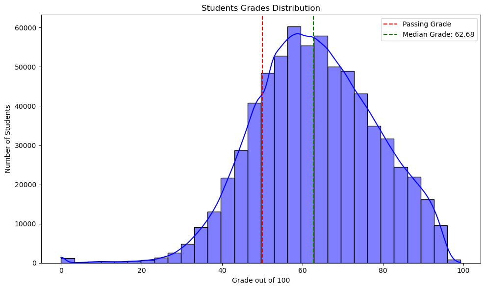
Let’s see if the Sanawya Amma grades are normally distributed.
plt.figure(figsize=(10, 6))sns.histplot(df['Percentage'], bins=30, kde=True, color='blue')# Add vertical lines for passing grade and median gradeplt.axvline(x=50, color='red', linestyle='--', label='Passing Grade')plt.axvline(x=df['Percentage'].median(), color='green', linestyle='--', label=f'Median Grade: {df["Percentage"].median():.2f}')# Add title and labelsplt.title('Students Grades Distribution')plt.xlabel('Grade out of 100')plt.ylabel('Number of Students')plt.legend()plt.tight_layout()plt.show()
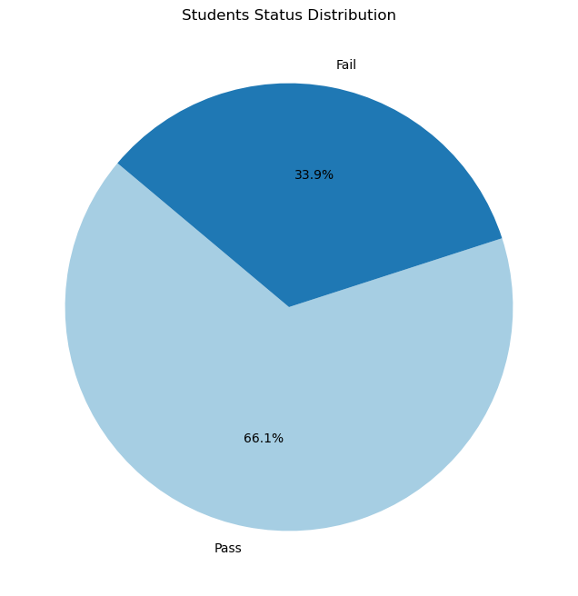
We see in the histogram that the grades are approximately normally distributed. This is a good sign that the test is fair. The grades however are not centered around 50% as we would expect. The median grade is ariund 63%. This means there are more students scoring above the average than passing grade rather than below it. This indicates that there are much more students passing the exam than failing it. We can see this in the pie chart below.
The pie char shows that the number of passing students is double the number of failing students.
Are all branches equal?
Let’s see how the students are distributed among the branches.
Note this graph is interactive. You can hover over the bars to see the exact number of students, and you can click on the legend to hide/show a branch.
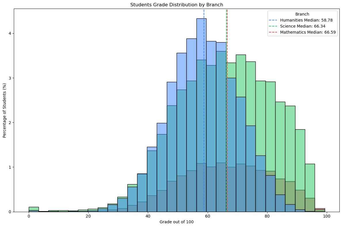
colors = {'Humanities': '#3b82f6', 'Science': '#22c55e', 'Mathematics': '#ef4444'}plt.figure(figsize=(12, 8))sns.histplot( data=df, x='Percentage', hue='Branch', multiple='layer', stat='percent', palette=colors, bins=30)for branch, color in colors.items(): branch_students = df[df['Branch'] == branch] median = branch_students['Percentage'].median() plt.axvline(x=median, color=color, linestyle='--', label=f'{branch} Median: {median:.2f}')plt.title('Students Grade Distribution by Branch')plt.xlabel('Grade out of 100')plt.ylabel('Percentage of Students (%)')plt.legend(title='Branch')plt.tight_layout()plt.show()
As we can see from the histogram, the grades for the Science and Mathematics branches are very simmilar. However, the Humanities branch has a lower much lower average grade. We can see in the histogram that the median grade for the Humanities branch is around 60%, while for the other branches it is around 65%. Moreover, the number of students scoring above 90% is much lower in the Humanities branch than in the other branches. This indicates one of two things: 1. The Humanities branch is harder than the other branches. 2. The students in the Humanities branch are less prepared than the other branches.
With the data we have, we can’t determine which of the two is true. However, we can see that the Humanities branch has a lower average grade.
How common is it to succeed in total yet fail in a subject?
Why do failing students fail?
A student is considered to have passed the exam if he scored more than 50% in every subject. Let’s see how common it is for a student to have a total grade above 50% yet fail in a subject.
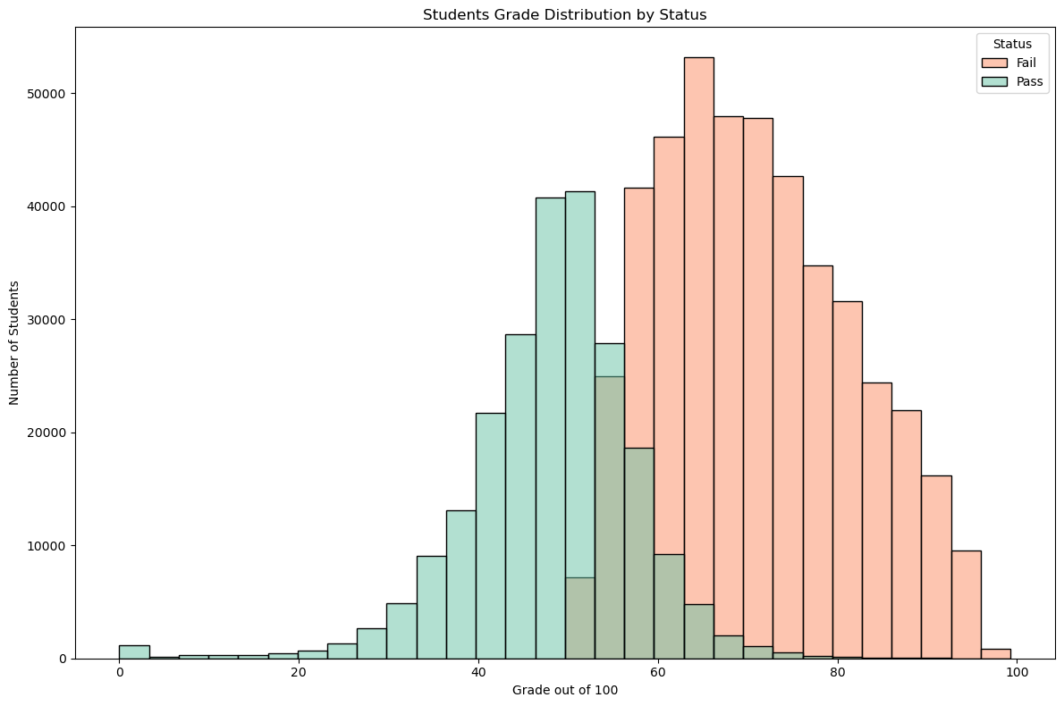
df['Status'] = df['Status'].astype('category')plt.figure(figsize=(12, 8))sns.histplot( data=df, x='Percentage', hue='Status', multiple='layer', stat='count', palette='Set2', bins=30)plt.title('Students Grade Distribution by Status')plt.xlabel('Grade out of 100')plt.ylabel('Number of Students')handles, labels = plt.gca().get_legend_handles_labels()ifnot handles: plt.legend(title='Status', labels=df['Status'].cat.categories)else: plt.legend(title='Status')plt.tight_layout()plt.show()
We make a very interesting observation. The grades distribution for failing student is normal and centered around 50%.
There is a common misconception that failing students are those who score very low in all subjects. However, this is not true. The grades of failing students are normally distributed around 50%. This means that failing students are those who score around the average in all subjects. This is a very interesting observation.
We can explore this further by seeing how common it is for a student to have a total grade above 50% yet fail in a subject.
/var/folders/vp/fng1b7k14nq4khc8kp2lp6wh0000gn/T/ipykernel_49788/2852520307.py:2: SettingWithCopyWarning:
A value is trying to be set on a copy of a slice from a DataFrame.
Try using .loc[row_indexer,col_indexer] = value instead

See the caveats in the documentation: https://pandas.pydata.org/pandas-docs/stable/user_guide/indexing.html#returning-a-view-versus-a-copy
  failings['Is Above 50'] = failings['Percentage'] >= 50
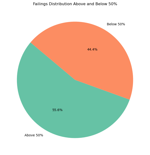
That’s astonishing to see. Around 44% of the students who failed the exam had a total grade above 50%. This means that almost half of the students who failed the exam scored above the passing grade in every subject.
This is a very interesting observation. It means that failing students are not those who score very low in all subjects. Instead, they are those who score around the average in all subjects. This is a very important insight for students preparing for the exam. It means that they should focus on all subjects equally. They shouldn’t ignore a subject just because they don’t like it or because they think they are bad at it. They should focus on all subjects equally to pass the exam. If you are sooo good in one subject yet horrible in another, you are likely to fail.
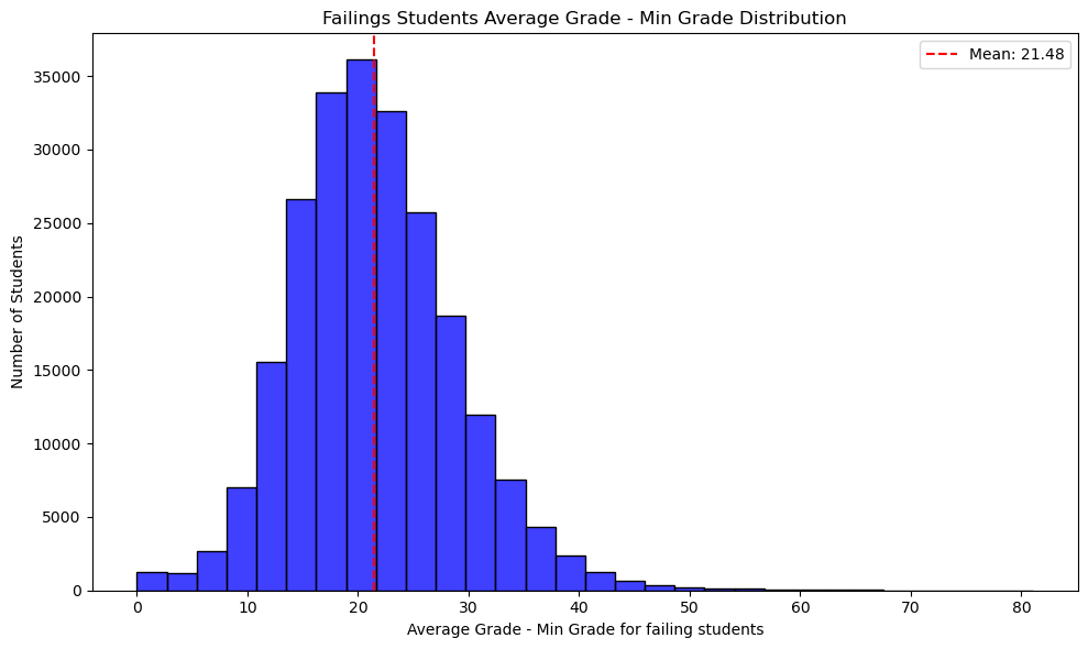
failings['Min Mean Difference'] = failings['Mean Grade'] - failings['Min Grade']plt.figure(figsize=(10, 6))sns.histplot( data=failings, x='Min Mean Difference', bins=30, kde=False, color='blue')mean_value = failings['Min Mean Difference'].mean()plt.axvline(x=mean_value, color='red', linestyle='--', label=f'Mean: {mean_value:.2f}')plt.title('Failings Students Average Grade - Min Grade Distribution')plt.xlabel('Average Grade - Min Grade for failing students')plt.ylabel('Number of Students')plt.legend()plt.tight_layout()plt.show()
/var/folders/vp/fng1b7k14nq4khc8kp2lp6wh0000gn/T/ipykernel_49788/3472875337.py:1: SettingWithCopyWarning:
A value is trying to be set on a copy of a slice from a DataFrame.
Try using .loc[row_indexer,col_indexer] = value instead

See the caveats in the documentation: https://pandas.pydata.org/pandas-docs/stable/user_guide/indexing.html#returning-a-view-versus-a-copy
  failings['Min Mean Difference'] = failings['Mean Grade'] - failings['Min Grade']
This graph again proves the same point. The average difference between a failing students minimum grade and his average grade is 21.48%. This is a very large difference. Once again this proves that failing students are those who ignore a subject and focus on others. This is a very important advice for students preparing for the exam: Don’t ignore any subject.
Are the Compassion Grades a myth?
There is a common belief among students that the ministry gives compassion grades to students who are close to passing. This means that if a student is very close to passing, the ministry will give him a few extra points to pass.
When we ploted the grades distribution, we saw that the grades are normally distributed. This means that the grades are fair and accurate. If the ministry was giving compassion grades, the grades wouldn’t be normally distributed. Instead, we would see a spike in the grades just above the passing grade. This is not the case. The total grades are normally distributed.
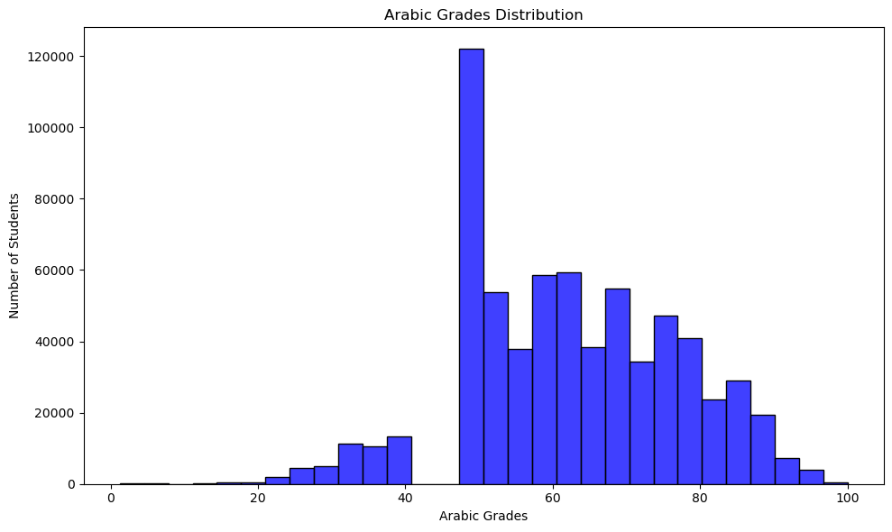
However, the marks are added on the subjects level. Hence, the myth might be true although the total grades are normally distributed. Let’s start exploring this by checking the distribution of the for the Arabic subject.
The myth seems true. The grades for the Arabic subject are not normally distributed. Instead, there is a HUGE spike in the grades just above the passing grade, and then the grades drop to 0. This is a clear indication that the ministry is giving compassion grades, but before making a conclusion, let’s quantify this phenomenon and check other subjects.
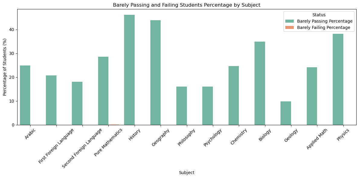
For each subject, we will calculate the percentage of students who failed within 2.5% of the passing grade and the percentage of students who passed within 2.5% of the passing grade. We will then compare these percentages to see if the ministry is giving compassion grades.
If the ministry is giving compassion grades, we would expect to see a much higher percentage of students passing within 2.5% of the passing grade than the percentage of students failing within 2.5% of the passing grade.
def get_barely_passing_students_percentage(df, subject, margin=2.5, threshold=50):returnlen(df[(df[subject] >= threshold) & (df[subject] <= threshold + margin)]) /len(df[df[subject] >= threshold]) *100def get_barely_failing_students_percentage(df, subject, margin=2.5, threshold=50):returnlen(df[(df[subject] < threshold) & (df[subject] >= threshold - margin)]) /len(df[df[subject] < threshold]) *100barely_passed_perc = [get_barely_passing_students_percentage(df, subject) for subject in subjects]barely_failed_perc = [get_barely_failing_students_percentage(df, subject) for subject in subjects]barely_passed_df = pd.DataFrame({'Subject': subjects,'Barely Passing Percentage': barely_passed_perc,'Barely Failing Percentage': barely_failed_perc})barely_passed_df_melted = barely_passed_df.melt(id_vars='Subject', var_name='Status', value_name='Percentage')plt.figure(figsize=(12, 6))sns.barplot( data=barely_passed_df_melted, x='Subject', y='Percentage', hue='Status', palette='Set2')plt.title('Barely Passing and Failing Students Percentage by Subject')plt.xlabel('Subject')plt.ylabel('Percentage of Students (%)')plt.xticks(rotation=45)plt.legend(title='Status')plt.tight_layout()plt.show()
The difference is so big that in the above bar chart we can’t even see the percentage of students who failed within 2.5% of the passing grade. So, let’s print the exact percentages to see the difference.
barely_passed_df
Subject
Barely Passing Percentage
Barely Failing Percentage
0
Arabic
24.907257
0.000000
1
First Foreign Language
20.700964
0.004478
2
Second Foreign Language
18.067144
0.004093
3
Pure Mathematics
28.560174
0.008562
4
History
46.203238
0.000000
5
Geography
43.848881
0.000000
6
Philosophy
15.973283
0.000000
7
Psychology
16.007772
0.000000
8
Chemistry
24.637011
0.000000
9
Biology
34.855668
0.000000
10
Geology
9.788448
0.000000
11
Applied Math
24.087328
0.000000
12
Physics
38.149330
0.000000
The difference is incredible. For 9 of the subjects, no student failed within 2.5% of the passing grade. This is a clear indication that the ministry is giving compassion grades. The myth is true.
Does city affect the grades?
An interesting question to ask is whether the city affects the grades. Are students from some cities more likely to score higher than students from other cities?
To make this analysis readable to a wider audience, I will begin by translating the city names to English.
Now let’s see how the grades are distributed among the cities.
cities = df['City'].unique()student_count = [len(df[df['City'] == city]) for city in cities]average_grade = [df[df['City'] == city]['Percentage'].mean() for city in cities]cities_df = pd.DataFrame({'City': cities, 'Student Count': student_count, 'Average Grade': average_grade})cities_df['Average Grade'] = cities_df['Average Grade'].round(1)fig = px.treemap( cities_df, path=['City'], values='Average Grade', color='Average Grade', color_continuous_scale='Blues', title='Grades Distribution over Cities')fig.show()
Unable to display output for mime type(s): application/vnd.plotly.v1+json
From the above tree map, we see that some cities have a much higher average grade than others. For example, students from North Sinai have average grades 74.6% while students from Minya have average grades 55.5%. This is a very large difference.
Now, I would like to know if the city’s average grade is related to the number of students from the city and the city’s geographical location.
fig = px.treemap( cities_df, path=['City'], values='Student Count', color='Average Grade', color_continuous_scale='Blues', title='Grades Distribution over Cities by Student Count')fig.show()
Unable to display output for mime type(s): application/vnd.plotly.v1+json
We notice a weak negative correlation between the city’s average grade and the number of students from the city. This means that cities with fewer students have higher average grades; however, the correlation isn’t very strong.
/var/folders/vp/fng1b7k14nq4khc8kp2lp6wh0000gn/T/ipykernel_49788/931561192.py:34: DeprecationWarning:

*scatter_mapbox* is deprecated! Use *scatter_map* instead. Learn more at: https://plotly.com/python/mapbox-to-maplibre/
Unable to display output for mime type(s): application/vnd.plotly.v1+json
From the map, it seems that northern cities tend to have higher average grades than southern cities.
Do all subjects have the same difficulty?
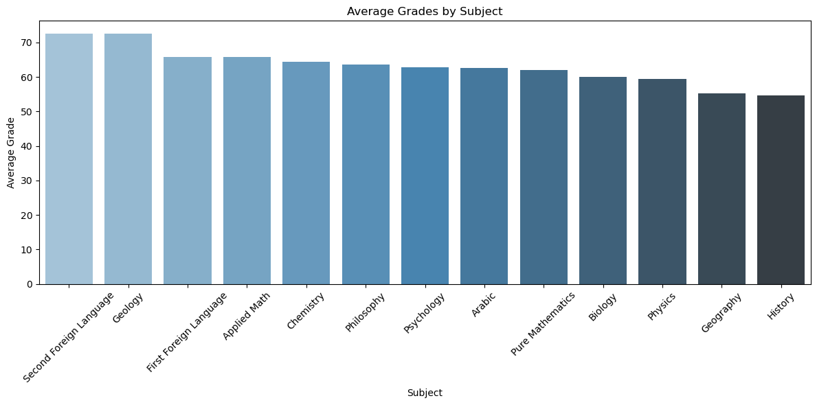
It is no secret that a student tend to find some subjects easier than others, but what’s important are subjects that are precieved as difficult by most students. To figure this out we will plot a bbar chart for the mean grade of each subject.
subject_avg_grades = [df[subject].mean() for subject in subjects]subject_avg_grades_df = pd.DataFrame({'Subject': subjects, 'Average Grade': subject_avg_grades})subject_avg_grades_df = subject_avg_grades_df.sort_values('Average Grade', ascending=False)plt.figure(figsize=(12, 6))sns.barplot( data=subject_avg_grades_df, x='Subject', y='Average Grade', palette='Blues_d')plt.title('Average Grades by Subject')plt.xlabel('Subject')plt.ylabel('Average Grade')plt.xticks(rotation=45)plt.tight_layout()plt.show()
/var/folders/vp/fng1b7k14nq4khc8kp2lp6wh0000gn/T/ipykernel_49788/2442988210.py:6: FutureWarning:


Passing `palette` without assigning `hue` is deprecated and will be removed in v0.14.0. Assign the `x` variable to `hue` and set `legend=False` for the same effect.
From this graph, we can see that the subjects are not equally difficult. The subjects that are considered the most difficult are: - History - Geography
The subjects that are considered the easiest are: - Second Foreign Language (French or German) - Geology
Conclusion
The Sanawya Amma exam is a major turning point in the life of any Egyptian student. In this notebook, we uncovered some interesting insights about the exam. I will summarize the most important insights here: - The grades are normally distributed, which is a good sign that the exam is fair. - The Humanities branch has a lower average grade than the other branches. - Failing students tend to score around the average in all subjects. This means students shouldn’t ignore any subject. - The ministry is giving compassion grades. The myth is true. - The city affects the grades. Northern cities tend to have higher average grades than southern cities.
If you have finished the exam, I hope you found this analysis insightful. If you are a non-Egyptian, I hope this notebook gave you a glimpse into the Egyptian education system. If you are a student preparing for the exam, I hope you found these insights useful. Remember, the exam is fair, and you should focus on all subjects equally. Don’t ignore any subject. Good luck!
Future Work
Starting from the year 2024-2025, the Egyptian education system started a new system for the Sanawya Amma exam. The new system has different subjects, different structure, and different education style. I am happy that the Egyptian education system is taking these steps to improve itself and mantain the high educational standards in Egypt. I am optimistic that the upcoming change will only lead the nation forward towards a brighter future and better education for all.
Based on my personal knowledge of educational systems, I suggest that the new system add multiple trials for the students. This will relieve the students from the enormous presseure and stress imposed on them by the exam. Multiple trials give students breathing space and allow them to perform better and show their true potential. It also cancels the unfairness caussed by a bad day and gives students a second chance to prove themselves and show their true skill and knowledge. Other international tests like the SAT and the IGCSE implement the multiple trials system and it has proven to be very successful and beneficial for the students.
I hope to analyze the new system in the future and compare it to the old system. This will allow us to see the impact of the new system on the students’ grades and the education system in Egypt.